2022 · Dista
Design system development
From fragmented design patterns across multiple projects to a unified, accessible, and documented system — the story of building La Ruche.

My Role
What I did
Research and study of design systems
Design tokens establishment
Crafting and evolving components in Figma
Documentation for the styles and components
Overseeing the creation of the coded components
Curation and maintenance of the design system
Achieved Impact
Measured outcomes
Standardisation errors in the application pages were reduced dramatically, estimated ~80%
The time taken to translate a concept to a Figma prototype was reduced to less than 50%
The team could assemble pitch prototypes within a short span of 2 days after requirements were finalised
The reuse of standardised coded components in the design ensured faster development cycles
The time taken for UI testing was reduced significantly
By ensuring WCAG compliance at component level, the app was made usable under direct sunlight
Execution
How we got there
Introduction
In 2020, I joined Dista as a designer. Dista being a small time startup, adapted a radical approach to customer pitches. We as a team would create a dummy app prototype with the customer requirements and showcase the same during the pitch, to give the stakeholders a taste of how the actual app might behave.
However, we were struggling with fragmented design patterns across multiple projects, which led to inconsistency in user experiences and inefficiency in development cycles. When I was working alone, it was easy for me to maintain consistency, but this approach was not scalable. So we felt the need for a component library, which would later become the design system, La Ruche.
Where to start though?
As a newbie (and a lone wolf) in creating a design system, I needed a point to start. Obviously, you study the giants and start looking at what they have been doing to manage designs across teams, spanning across time zones. So I studied the way design systems were laid out by IBM (the carbon design system), Google (Material Design), Atlassian (Atlassian design system) and salesforce (lightning design system). These systems were studied in depth based on a feeling that these would be the most comprehensive ones.
After studying all these libraries, I realized that all of them have been curated to their specific needs and not for the general purpose. They were very helpful in understanding the naming conventions, tokens and structure but were not useful as is. There wasn't one single design system out there, which could have been used as-is for the platform I was tasked to uplift.
Setting up the foundation
Earlier, we used to create a set of reusable components in a file as a practice. However, what I was dealing with was the platform, which will hold multiple apps. There were a lot of custom components in the platform. I decided to go the reverse engineering way to build a library. I took screenshots from all possible states and screens and started decoding them for the components they use. I also did have the user feedback handy and this allowed me to come up with the lists of components that were being used, were missing from the UI, were confusing and so on. I listed them down and categorized them in different buckets like 'Update', 'Change', 'Discard' and most importantly 'Add'. At the end of this exercise, I had a comprehensive list of all the components that we had and possibly needed. Based on the knowledge gained by studying the systems and the list at hand, I opened Figma.

Visual vs Functional components
One of the foundational choices I made was differentiating between logical and visual components in the system architecture. Traditionally, the components that appear similar are grouped together. However, I took a more functional approach to design and came up with the function segregation.
This meant, for example, instead of setting up card as a component, I decided to add card_job and card_person as two distinct components. This allowed me to get a finer control over the components, without worrying about the consequences in the other components.

Maintaining Accessibility
To maintain adequate contrast between the text and the background elements, the colour system was tested with tools like contrast. To ensure that the designers use the right text variation (black or white) a little indicator '♦' was added in front of the colours which should be used with White text.

All the components were designed to wrap text to accommodate increased font sizes. Since Figma did not possess those abilities at the time, careful engineering guidelines were created where the individual text elements were marked as Wrap vs Truncate.

Managing Disabled Components
Disabled components are usually light grey with dark grey content, which may lead to visibility issues in the bright sunlight. So I introduced Hatching. The disabled components maintained enough text to background ratio, yet indicated the disabled state with the textures.
While deciding upon the colours, I started digging a bit deeper in WCAG 2.1 and made sure that all the colour combinations I was going to use in the system were following at least the AA level contrast and so on. I received a great deal of help from my mentors while making the colours pop, while keeping them within decent saturation zones.

Measuring the Design Library
Any design system is like a product you ship. You need to talk to customers, get their feedback and go on continuous improvement. This component system and documentation efforts were put to test with the same context — assembling app pages to create a prototype from the requirements.
We gave two designers, one senior and one junior the same requirements. The junior designer was allowed to use the design system while the senior designer was not (to establish the baseline). Following are the results from the test.
The library was tested with every newly onboarded member of the design team and efforts were made to make the experience smooth as possible.

Documentation
All the design decisions and components were uploaded and shared with Zeroheight (Powerful yet Free) for internal consumption with the following:
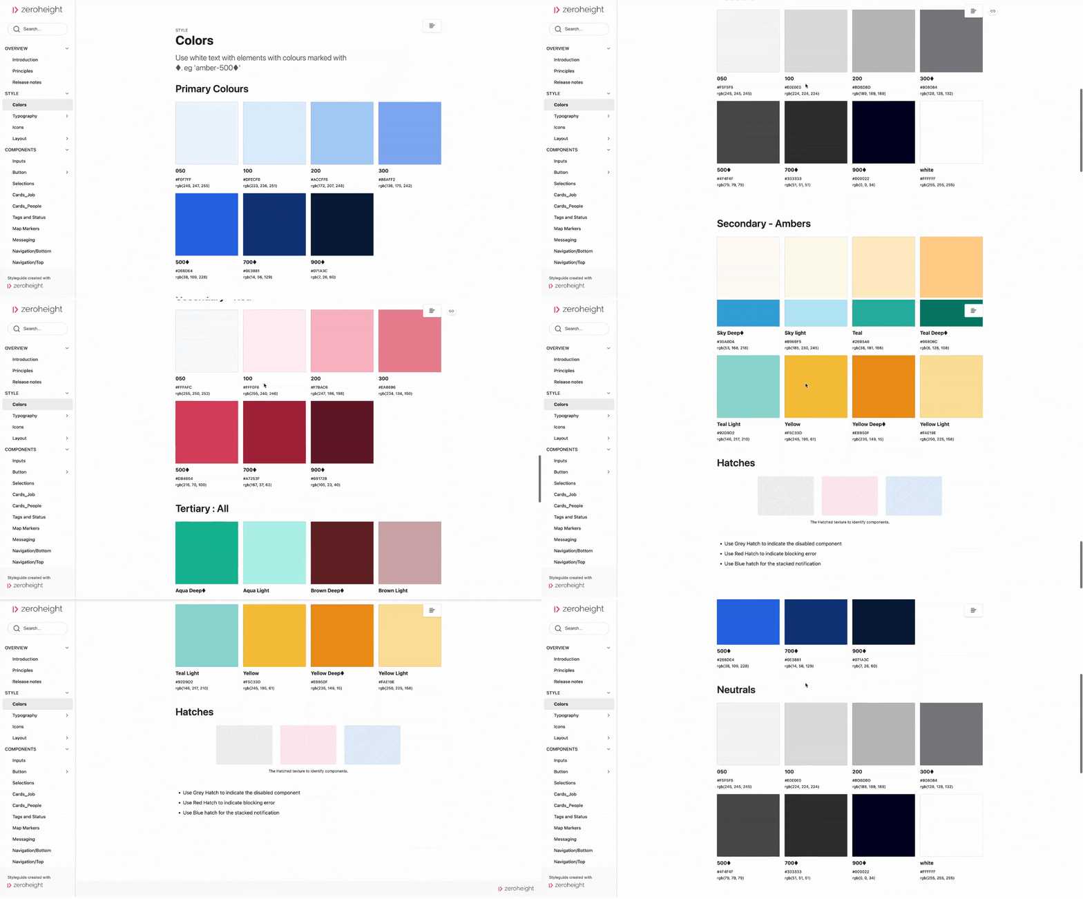
What each component documented
When to use
Restrictions if any
Typography and Colour tokens associated with the same
Accessibility checks
Font scaling strategy
Variations
Stakeholder Buy-in
Making the Bosses listen
After demonstrating the success and pace with the design library, it was time to convert it into the design system. That meant, creating reusable components for both Android and iOS and making the code available to all the engineers. The same documentation created on Zeroheight was used to craft the components and enable the reusability in the code.
Developing a design system was going to consume significant amount of time, but by demonstrating the effective use of reusable components, it became easier to convince the leadership to invest time and effort into making this happen.
Once the developed components were ready, the custom POC development also got faster. Unfortunately, I did not capture the exact numbers to identify the actual impact!
Un-unleashing creativity!
No matter how much effort I added, the desired outcome was not coming out as I had expected. The reason was simple. Every designer was a designer. All of us were from different backgrounds and had our own perceptions towards layouts and placements. To counter that, I went back to the drawing board and defined a few rules for the design team to follow. These were a combination of UX best practices, our product roadmap and overall foundational values. I was in the process of overhauling the navigation patterns and journey maps as is. These helped in establishing a check in the early stages of design too.
Every layout we designed on paper or whiteboard, was to be checked against these 8 parameters and when it passed all the tests, it was allowed to go to Figma. This has allowed us some basic consistency across the product lines.

Governance vs Flexibility
While maintaining the design system, I learned that there has to be a delicate balance between the governance and flexibility. If the design system is too restrictive, the designers might end up adjusting the concepts around the rigid components, thereby not being 100% creative. If the design system is too flexible, we might not achieve consistency. Since the team was small and well knit, we did not have significant problems. However, the lesson is the governance should not restrict the individual creativity of the designers.
The work is never done!
Can someone be done with building a design system? Never. It is an organically growing animal that requires constant attention, maintenance and upgrades. While building the system I learned the most important lesson of the design world — empathy towards your fellow designers!

As a curator of the system, I have to be careful about everything, ranging from naming conventions to maintaining variants. Every single time, when I try to add a component into the system, I create numerous use cases, validation and error scenarios. I run these by tech leads and they validate the list. I then create a completely loaded component that can suffice all use cases, for now.
Working on a design system makes other designers, your colleagues, your users. Working on this massive project has taught me to be more empathetic, more process-oriented, more documentation oriented and overall a better designer than I was before!
Closing Thoughts
A system that outlasted the sprint.
La Ruche became the shared language across design and engineering at Dista — used across the web platform, the mobile app, and onboarding new team members. The accessibility-first approach meant that the system stayed compliant as the product grew, rather than needing a retroactive audit.
More about the platform it served can be found at the company's home.
dista.ai